


 Seller Dashboard
 Logout
Did you know that the inventor of the color wheel, as we know it today, was none other than Sir Issac Newton?
What was the reason that one of the greatest minds of the world was invested in studying color palettes?
The reason was that the human mind’s complexity was and is still a mystery to be solved. Something so basic such as the color of the wall or the table we are eating at can have a great impact on our mood and appetite.
According to various studies, women can see more shades of red. Even the human anatomy tells us that colors aren’t just colors.
But why am I telling this to you?
Color palettes in UI design can help you bring more personality and voice into your craft.
As a UI designer, you have the power to make users attracted to certain spaces of the website. There are a lot of elements that can help you do that but here is one more for you: Colors.
Read this blog to get an idea of:
- The color wheel and basic understanding of brand color palettes
- Color Palettes and the impact it has on Psychology
- Practical rules to follow while picking out color palettes
- How can you leverage color theory in UI design
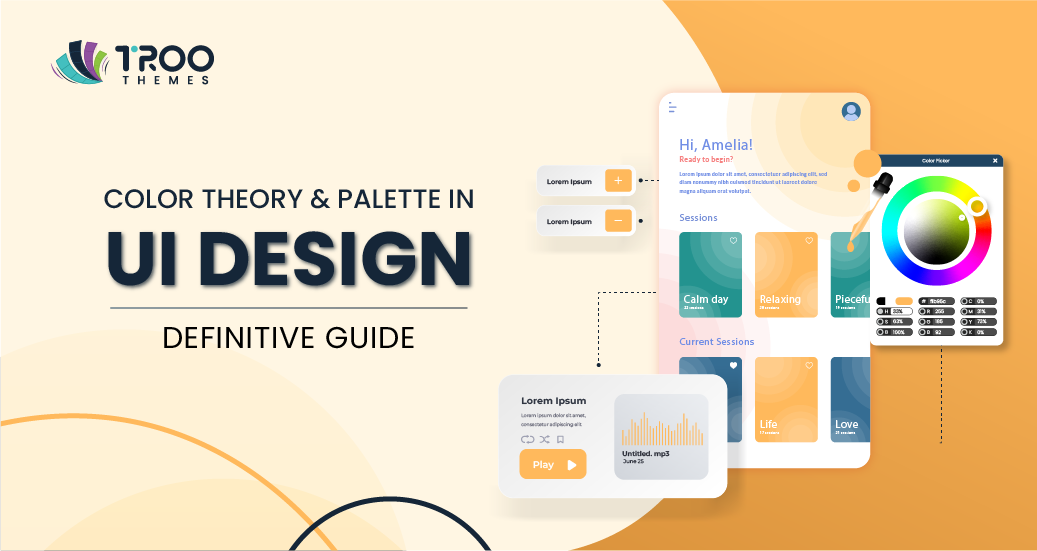
What is a Color Palette?
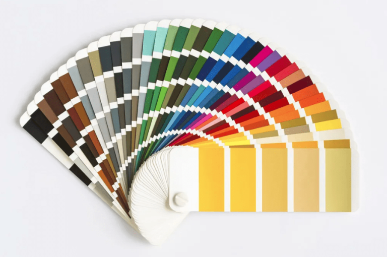
Understanding The Color Palette through the Color Theory
I can hear what you are saying.
“I have seen this in school, I know this already”.
You have seen this everywhere. Schools, colleges, art classes, and places that you don’t even remember.
Your understanding of picking apt color palettes comes from the color wheel.
The inventor of the color wheel is one of the greatest minds in the world. You can only imagine the kind of impact he must have thought colors had in our world, which led him to build a framework to see something we keep seeing all day from a different perspective: Colors.
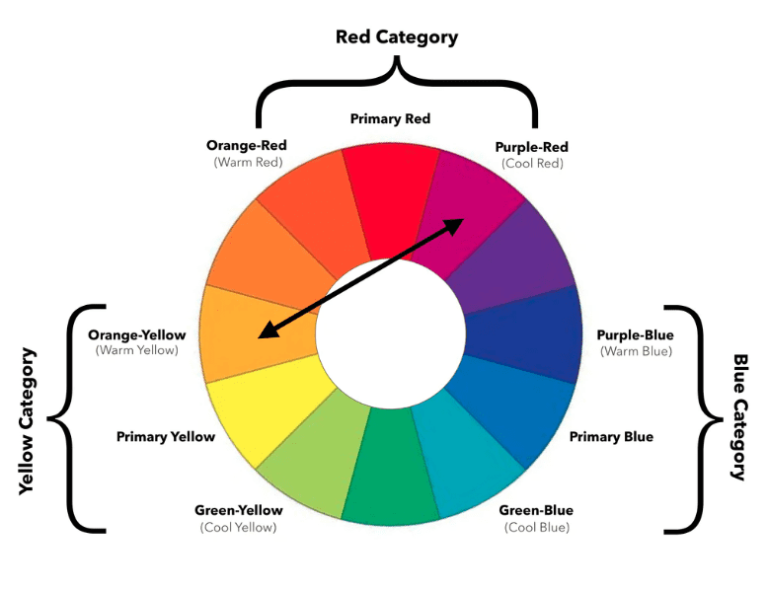
Let’s delve deep into the color wheel and break down its parts to understand how you can leverage color palettes in UI design:
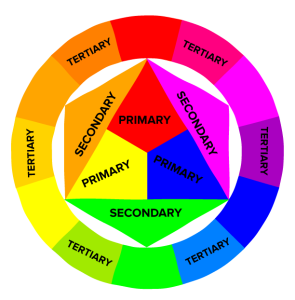
1. There are three primary colors: Red, Yellow, and Blue. Every color palette that you can possibly pick comes from these primary colors.
2. Primary colors can be mixed to derive more colors.
- Red + Blue = Purple
- Red + Yellow= Orange
- Yellow + Blue= Green
And so on.
3. You can create tertiary colors by mixing a primary color with a secondary color.
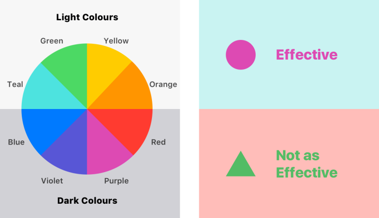
4. You can further classify colors into cool, warm, and neutral colors. This is based on the tone of the color.
For ex, shades of blue are cool, and shades of yellow and red are warm.
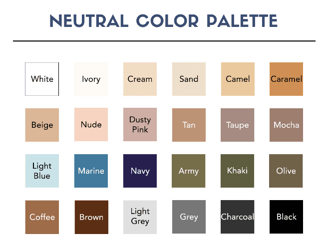
There are some other colors that are neutral, and are soothing to the eye, like the ones shown below:
Cool tones are more likely to put users in a calm, peaceful mood and warm colors are preferred to excite them or make them perform certain actions sooner.
Neutral tones help to bring other forms of content to the forefront, so they are preferred as background colors.
5. Deciding the theme of the color palette:
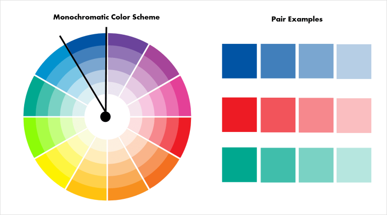
- Monochromatic: Monochromatic color palettes are created when we use one bold color and multiple variations of that one color. Having a monochromatic color palette will go a long way in not overwhelming the users with tons of new shades and hues.
- Analogous: When we use colors that are placed next to each other on the color wheel, the color palette developed is called as an analogous one.
Analogous color palettes are generally found in the nature, they are vibrant and also a safe choice as they mostly go well with each other. - Complementary colors: Next, you can use colors that are opposite to each other on the color wheel. Complementary color palettes create a nice balance in the page as one color is usually more dominating and the other brings more focus towards other elements.
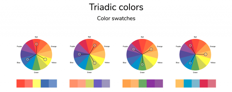
For example, colors such as red and green, yellow and purple and others which are placed opposite to each other go well together. - Triadic: Pick out three colors that are equally spaced from each other in the color wheel.
Some very well-known color combinations are: Red, Yellow and Blue. You can also consider Green, Orange and Purple. If you take a closer look at the color wheel, you will be able to come up with more triadic color palettes of your own.
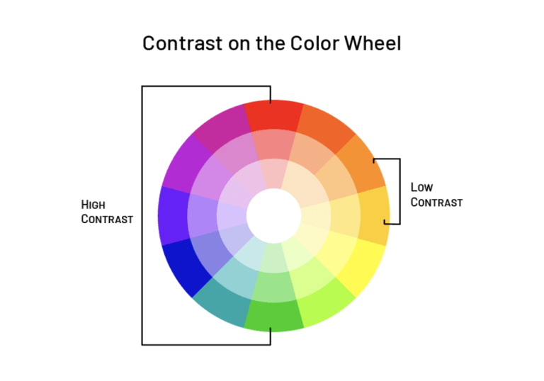
- Contrast: Want your content to pop? Or do you want to provide a more immersive reading experience?
Adopting contrasting color palettes is usually done to immerse the viewer and make certain blocks of content pop more than others.
You can use multiple options such as white with black, light blue with dark blue, and much more. See the example below:
Psychology Behind Picking the Right Color Palette
You can deliver a great user experience by learning how to leverage color palettes in UI design.
Being a UI designer, your core focus is delivering an enhanced user experience through all the elements at hand. Ofcourse you have to make their journey smooth so that they can buy from your website. But you also have to ensure that they feel good about making that purchase decision.
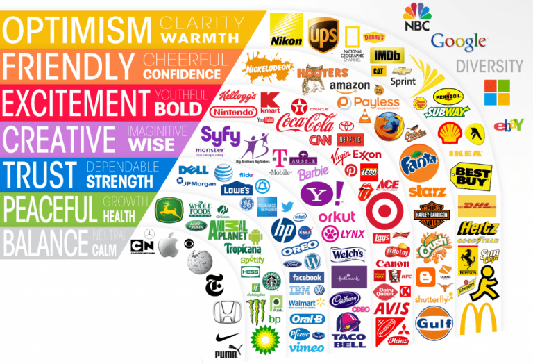
Many studies say that the combination of yellow and red makes people feel more hungry. Pink is supposed to calm your nervous system. Blue is regarded as the color of trust.
Imagine, you are getting to impact the mind of the end user just by choosing different color palettes.
Not by engaging copy, not by crazy animations and elements, just color palettes that align with what the brand wants to achieve. This is especially true for product-based companies.
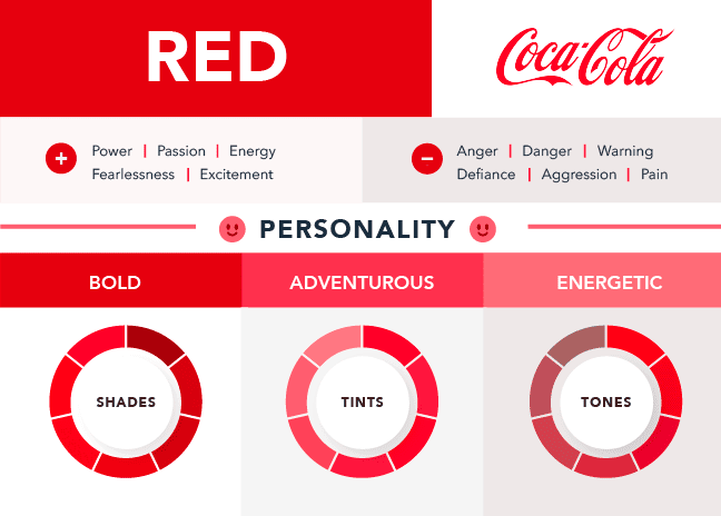
For example, people preferred the taste of Pepsi over that of Coca-Cola in blind taste tests, but when they were asked to decide based on the packaging, their preference shifted to Coca-Cola.
Why?
Coco-Cola’s signature red and white packaging brought with itself a nostalgic, christmassy feeling to the user’s mind.
There are a lot of considerations that you need to consider while picking color palettes. You need to delve deep into how your customers perceive color, and that depends on so many factors such as:
- Culture: Red is a beacon of love and celebrations in Western countries, while in Japan, red is the epitome of self-sacrifice, authority, power, and many other things.
- Age and gender of your audience. Men would pick a bold color like blue or green and women would pick a softer tone like purple.
- Are the color palettes you picked up aligning with other elements of your brand
And much more.
TL; DR?
Colors have a crucial role in impacting the psychological state of customers. While you can experiment and play around with other elements, playing with color palettes in UI design can also have an enormous impact. Try it out!
Now, let us explore how you can play around with the element of color and choose the perfect color palette.
How to play around with color palettes for a UI designer?
As a UI designer, you have to have the right mix of creativity, awareness of latest design trends, and a general understanding of the impact of color theory on user behaviour.
You have to understand the trends that you will give in to and the ones that you will steer clear from. You also need to perform solid user research to understand your audience better.
Apart from that, here is the process you need to follow to pick the right color palette for your UI design:
Choose your primary, secondary, and tertiary colors to start creating color palettes.
Try to keep the brand story and positioning in mind while selecting your color palette.
For example, do you want to build on trust like Facebook, or excitement and nostalgia like Coca-Cola?
The primary color you choose will be the most bold representation of your brand. It will be the most prominent color across the screen. Limit your choice of a primary color from 1 to 3 choices.
- Background: Colors such as absolute white or black usually have high contrast and strain the eyes. Opt for more neutral colors that provide a more comfortable experience.
- Consistency: Having one color for all link buttons, and one for all CTAs helps to play with the user psychology in a very passive yet impactful way.
- Use Semantic colors: Some colors have a universal meaning, for example, red for danger. Apart from certain cultural contexts, leverage the universal semantics too to engage with the user more. To be able to leverage this, you can learn a little more about color theory from various resources online.
The 60-30-10 Rule for creating stunning color palettes
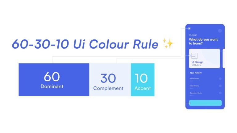
If you haven’t already heard of the rule, the 60-30-10 rule is a simple framework of color theory that guides UI designers on how much color should be allotted to individual sections of the website.
It states that:
- 60% of your space should be colored in a primary color.
- 30% with a secondary color.
- 10% with an accent.
As a UI designer, visual real estate matters the most to you. This particular framework guides on how much of the real estate you should allot to a specific color.
This proportion helps you to maintain a primary color scheme while also keeping a secondary color in mind and having one color for crucial real estate such as CTAs, and others.
That’s color theory at its best.
Use Contrast Effectively
Color theory can be used to grab the user’s attention to certain areas of the website.
As a UI designer, you have the power to draw users’ attention to the areas you want to. It is a powerful tool to drive more sales, connect deeply with audiences, and enhance the overall user experience by a significant level.
Basics of color theory:
Color theory, as we know today, as has three elements, namely HSL.
HSL stands for hue, saturation, and lightness.
Hue is a code that represents a color you pick from the wheel. For example, 0 or 360 means red. 120 denotes green and 240 is blue.
Saturation denotes how strong the color is and lightness represents the amount of light that the color has.
You could leverage all these elements to create a custom and unique color of your choice.
Why should you choose TRooThemes as a UI designer?
As a UI designer, you are operating under brand guidelines that you have to adhere to.
You could leverage the power of colors to enhance the personalization of your deliverables.
At TRooThemes, we believe in giving designers the power to customize all elements of the theme such as typography, color palettes, element design, and everything under the roof.
We make eye-catching themes accessible to you via our exclusive marketplace.
Visit our marketplace and find the theme that calls out to you the most!
Make your UI/UX design process much more smooth and professional with TRooThemes.