


 Seller Dashboard
 Logout

Visitors do not wait. The moment a page loads, users decide whether to stay or leave. This decision often happens within three seconds. For businesses, developers, and theme creators, this short window defines whether a website succeeds or fails.
Their influence extends beyond the aesthetics. It has a direct impact on the engagement of websites, their conversions, and the overall performance. A sluggish or baffling experience drives away users before they can even comprehend what you are offering. Conversely, a quick and easy interface instills confidence at first sight.
That is the point when the 3-second rule plays a crucial role. It informs how you go about optimization of landing pages, the UX design of the website, and general web design guidelines.
Build Better First Impressions
Create fast, user-focused websites with proven design principles.
What Is the 3-Second Rule in Web Design?
The 3-second rule is the amount of time a visitor needs to make a judgment of your website. In these few seconds, users determine relevance, usability, and trustworthiness.
When the idea behind the website is not evident at first glance, the visitors go. When the page is slow to load, they go. When navigation is confusing, they go away. This practice is directly connected with conversion rate optimization, in which any slight changes in initial engagement can result in improved outcomes.
To the theme purchasers and developers, this rule emphasizes the need to develop designs that convey value immediately. An effective site does not need to be worked hard in order to be comprehended.
The Psychology Behind Instant User Decisions
Speed and simplicity are the driving forces behind human behavior online. The first time a user visits, he/she reads full pages very rarely. They would rather search for clues that would enable them to determine whether the site is worth their time.
Here, visual hierarchy is important. Attention is dictated by large headings, contrasting colors, and based layouts. When nicely completed, the user is able to decipher the message in a few seconds.
Cognitive load is a similar element. Users get annoyed when the website is cluttered or overwhelmed. Cutting out unnecessary information can increase readability and save users’ attention.
Another key factor is trust. Such aspects as clean design, readable fonts, and professional images are indications of credibility. Even minor design defects can diminish trust and skyrocket bounce rates.
Website Loading Speed: The First Barrier to Engagement
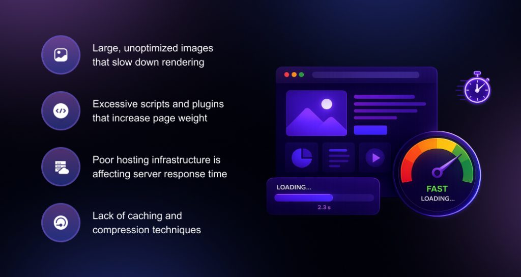
Even before design comes into the picture, loading speed is what will make or break you, by determining whether the end user will see what you have to offer or not. Even a few seconds of delay can have a huge effect on the engagement.
There are some factors that affect the speed of loading websites:
- Large, unoptimized images that slow down rendering
- Excessive scripts and plugins that increase page weight
- Poor hosting infrastructure is affecting server response time
- Lack of caching and compression techniques
Improving website performance starts with addressing these technical issues. Fast-loading websites not only retain users but also perform better in search rankings. For businesses, this directly impacts visibility and conversions.
A business relying on best free wordpress themes for business often compromises long-term growth for short-term savings.
Improve Your Website Today
Enhance speed, design, and usability with ready-to-use templates.
Above-the-Fold Design: Grabs Immediate Attention
The initial part of a webpage is the first area that will establish the mood of the whole experience. It is here that users have a choice on whether to keep exploring.
An effective above-the-fold design should clearly communicate three things:
- What the website offers
- Who it is for
- What action the user should take next
In this section, clarity is of more importance than creativity. The powerful headline, a brief supporting message, and an unambiguous call to action can lead users immediately.
Spacing and layout also matter. A clean structure improves readability and helps users focus on the main message without distractions.
Visual Design That Establishes Instant Trust
Perception is a direct result of design quality. Users concur with clean and modern layouts as they recognize them as professional, but cluttered layouts raise doubt.
Typography must be user-friendly and can be used on a variety of devices. The colors must be used to support the brand, but must have contrast to ensure ease of use. Pictures must be pertinent and of high quality, rather than generic and distracting.
Stability between pages enhances the user experience. When the elements are predictable, the users are more at ease using the site.
To the creators of the themes and those selling their creations in the marketplace, this translates to focusing on the usability more than the visual appeal. An effective theme ought to assist companies in delivering their content in the first two seconds.
Navigation and Clarity: Making the Next Step Obvious
After the user has settled on remaining, the other challenge is how to transfer the user smoothly through the site. Navigation is an important part of this process.
Menus are to be straightforward and made in a logical manner. Users do not need to ponder over where to move next. There are minimal choices, and labeling effectively lessens confusion.
The calls to action must be prominent without taking up too much of the design. The next step must always be visible, whether it is the sign-up process, product exploration, or contacting a business.
Less friction in navigation enhances user experience on websites and increases the likelihood of conversion.
Mobile-First Experience: A Non-Negotiable Standard
Nowadays, a very good portion of net traffic comes from mobile devices. This is why cellular-first design is a must for websites today.
Responsive layouts allow content to adapt to unique display screen sizes. But responsiveness on its own is not enough. Mobile also wants to be lightweight and smooth to use.
Mobile-friendly navigation, smooth to examine textual content, short load times, and a certain clean cellular experience, ignoring cell customers can imply too many leaps and quotes, overlooked possibilities.
For manufacturers and theme vendors, mobile optimization needs to be a core feature, not an afterthought.
Common Mistakes That Break the 3-Second Rule
Many websites fail now not because of loss of effort, but because of avoidable errors.
Some common issues are:
- Slow loading pages that test user patience
- Unclear messaging that confuses visitors
- Overcrowded layouts that increase cognitive load
- Excessive animations and pop-ups that distract users
By eliminating these difficulties, website engagement can be increased appreciably. Small changes often result in major outcomes.
Practical Ways to Improve Website Performance and UX
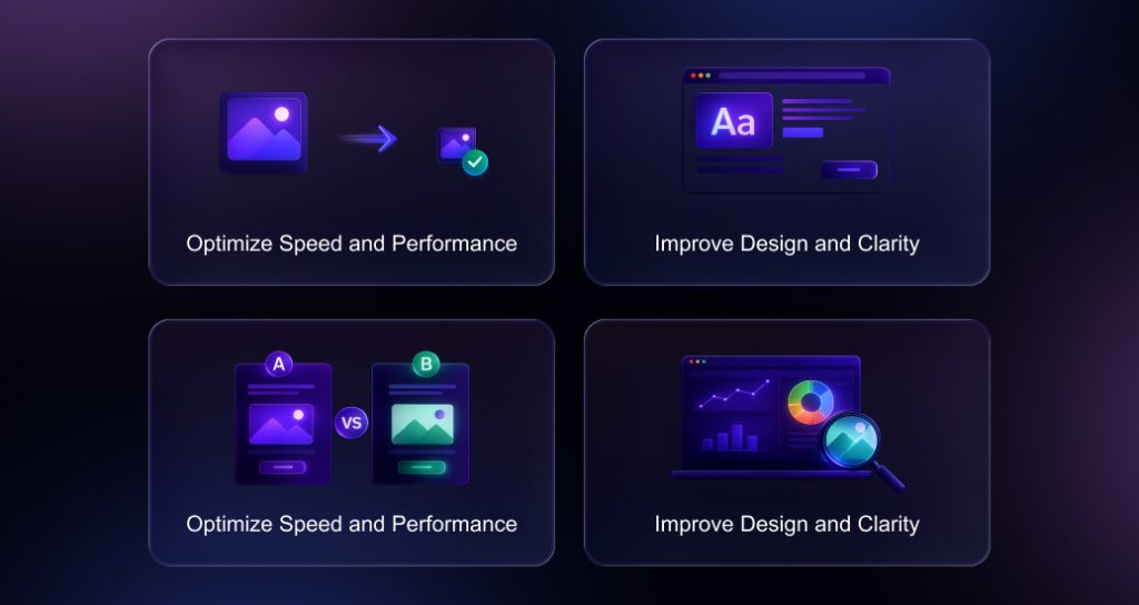
Upgrading a website doesn’t always require a complete redesign. Strategic adjustment can deliver a brief victory.
Start by optimizing images and reducing unnecessary scripts. Choose reliable hosting to ensure consistent performance. Use caching to speed up repeat visits.
From a design perspective, focus on clarity. Simplify layouts, refine messaging, and ensure that each page has a clear purpose. Test different variations to understand what works best for your audience.
Regular analysis is also important. Monitoring user behavior helps identify areas that need improvement.
3 Second Rule Importance for Businesses and Theme Sellers
For businesses, the 3-second rule has a direct impact on revenue. A stronger first impression means more engagement, more trust, and better conversions.
It defines product quality for theme creators and vendors in the marketplace. Buyers want templates that are not only beautiful but also optimized for performance and usability.
If developers focus on speed, structure, and clarity, they will produce products that deliver real value. This makes their themes more competitive and popular.
In both cases, the key to creating effective web experiences is understanding how users behave.
Conclusion: Designing for Instant Impact
The 3-second rule is not just a design concept. It is a practical guideline for improving how websites perform and engage users.
Every detail, from loading speed to formatting and navigation, contributes to the first impression. When these elements are painted together, customers stay longer, interact more, and are more likely to convert.
For organizations, this means better results for current site visitors. For developers and theme designers, the method is to create products that meet real individual expectations.
Platforms like TRooThemes guide this approach by presenting themes and templates designed with functionality, readability, and usability in mind. This enables consumers and retailers to create websites that immediately capture interest and provide a solid user experience.
A properly designed website no longer asks for guesswork from customers. It clearly communicates from the moment they arrive.